
Brand Identity Overview
Route Runners Delivery Service (RRDS) is adamant to stand out as more than just a logistics company: it's a promise of streamlined efficiency, reliability and the simplicity of getting the job done with as little fuss as possible. As such, the brand identity must encapsulate these core values, ensuring that, along with their impeccable service, it will leave a lasting impression on their clients.
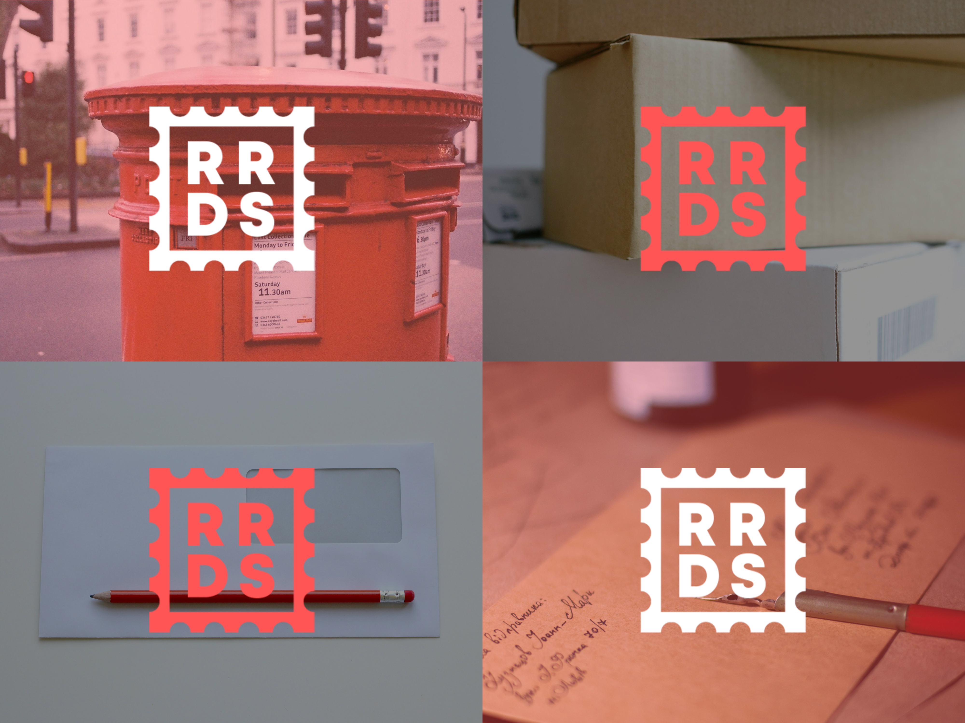
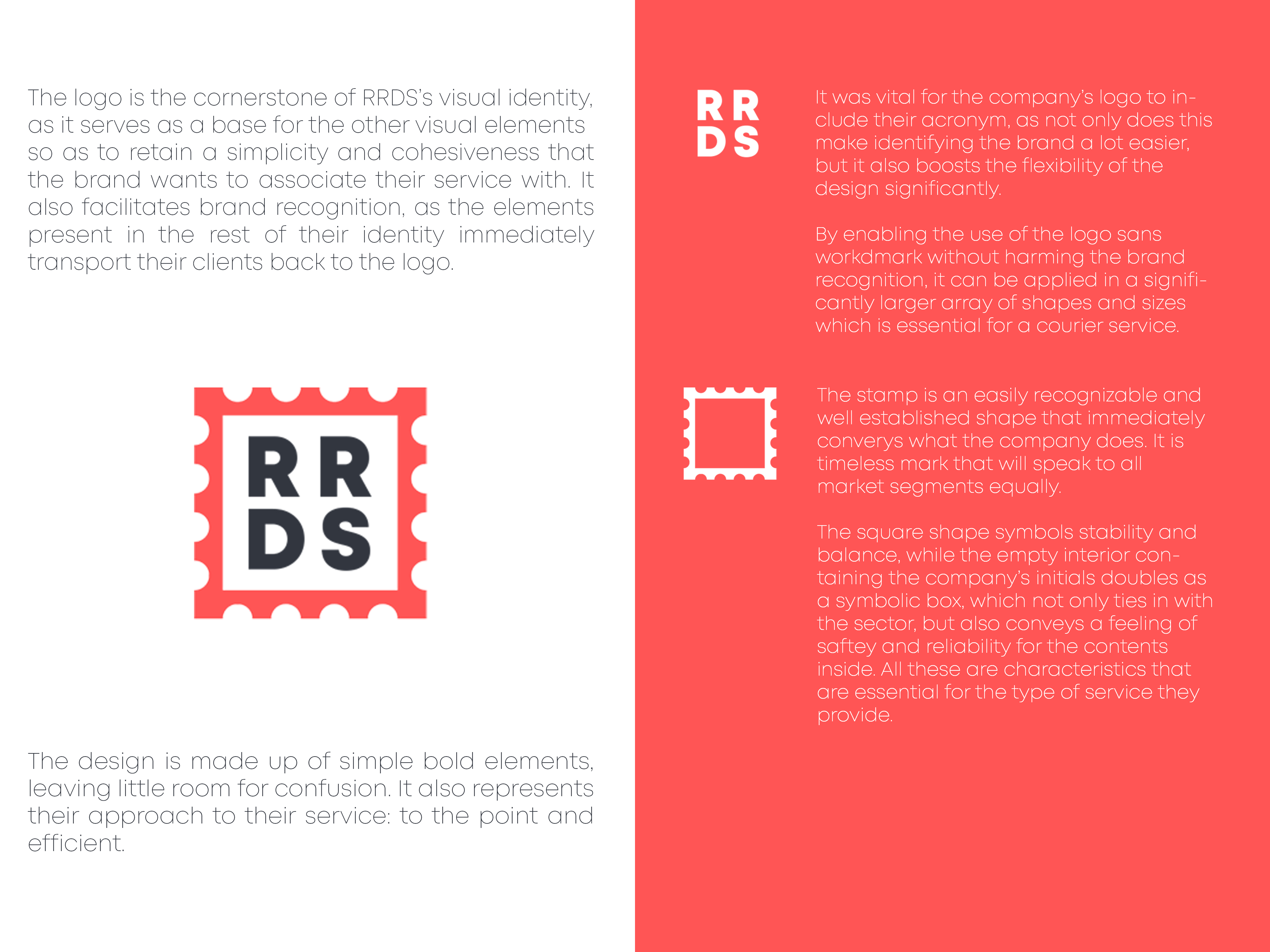
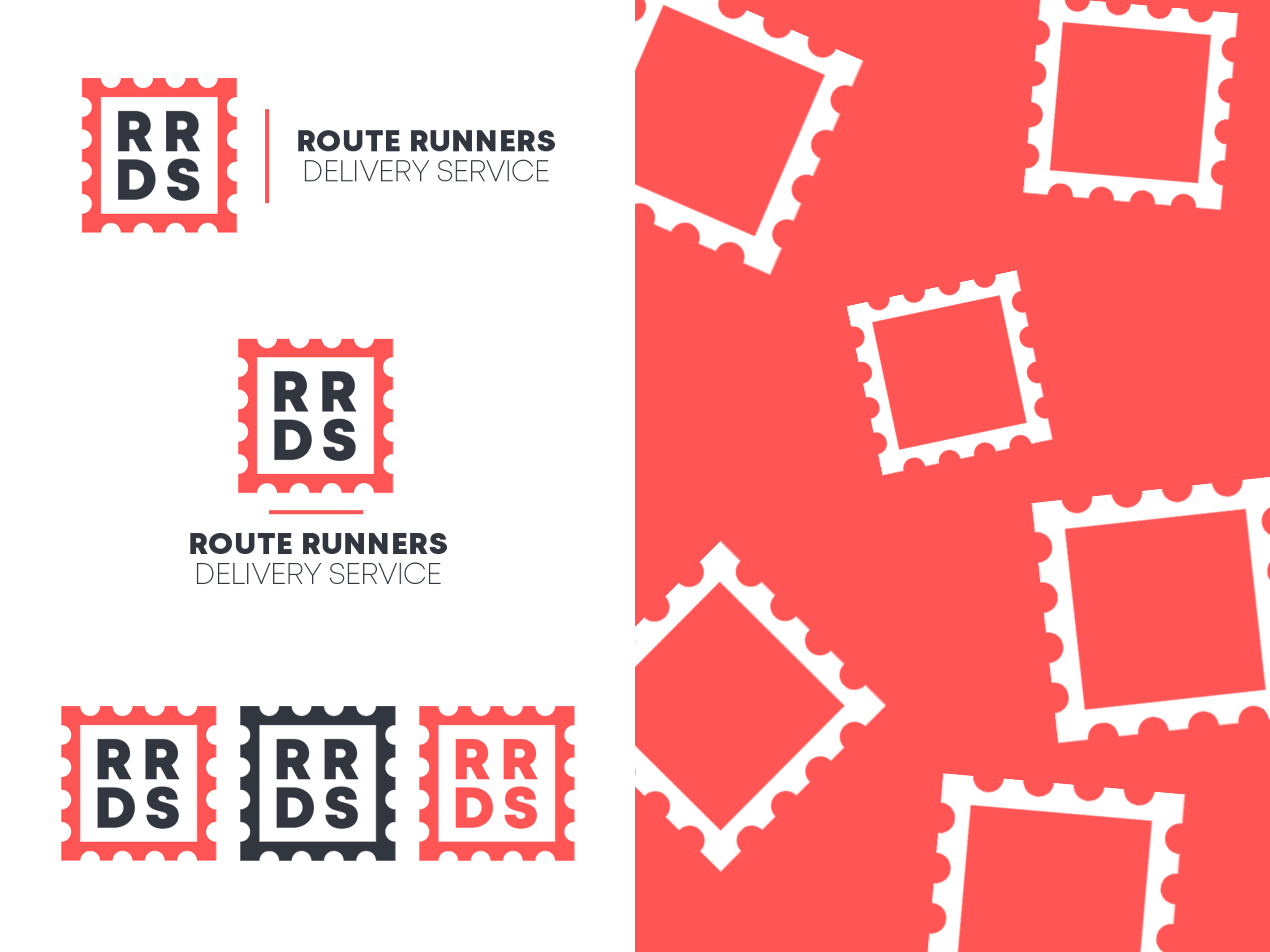
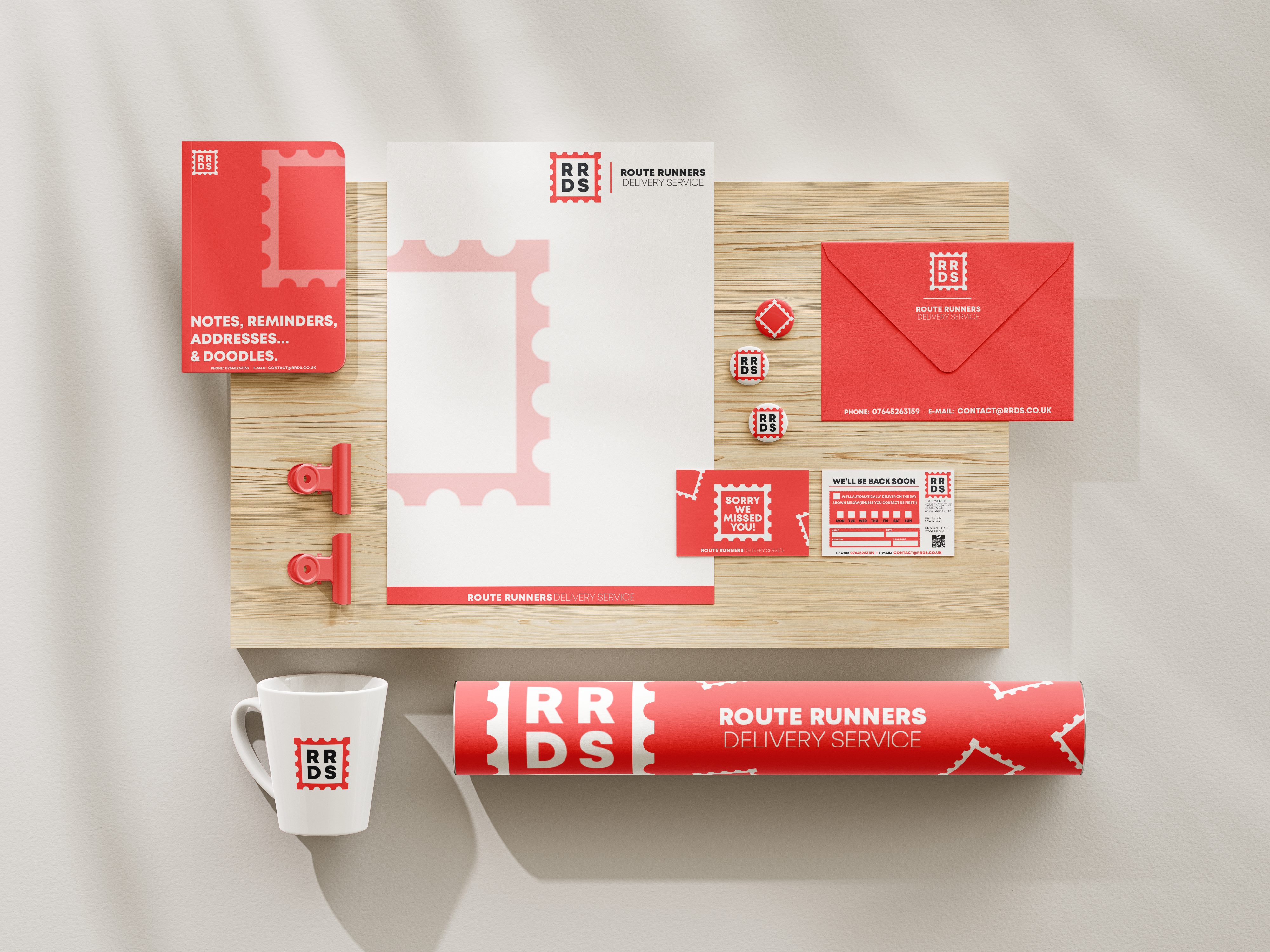
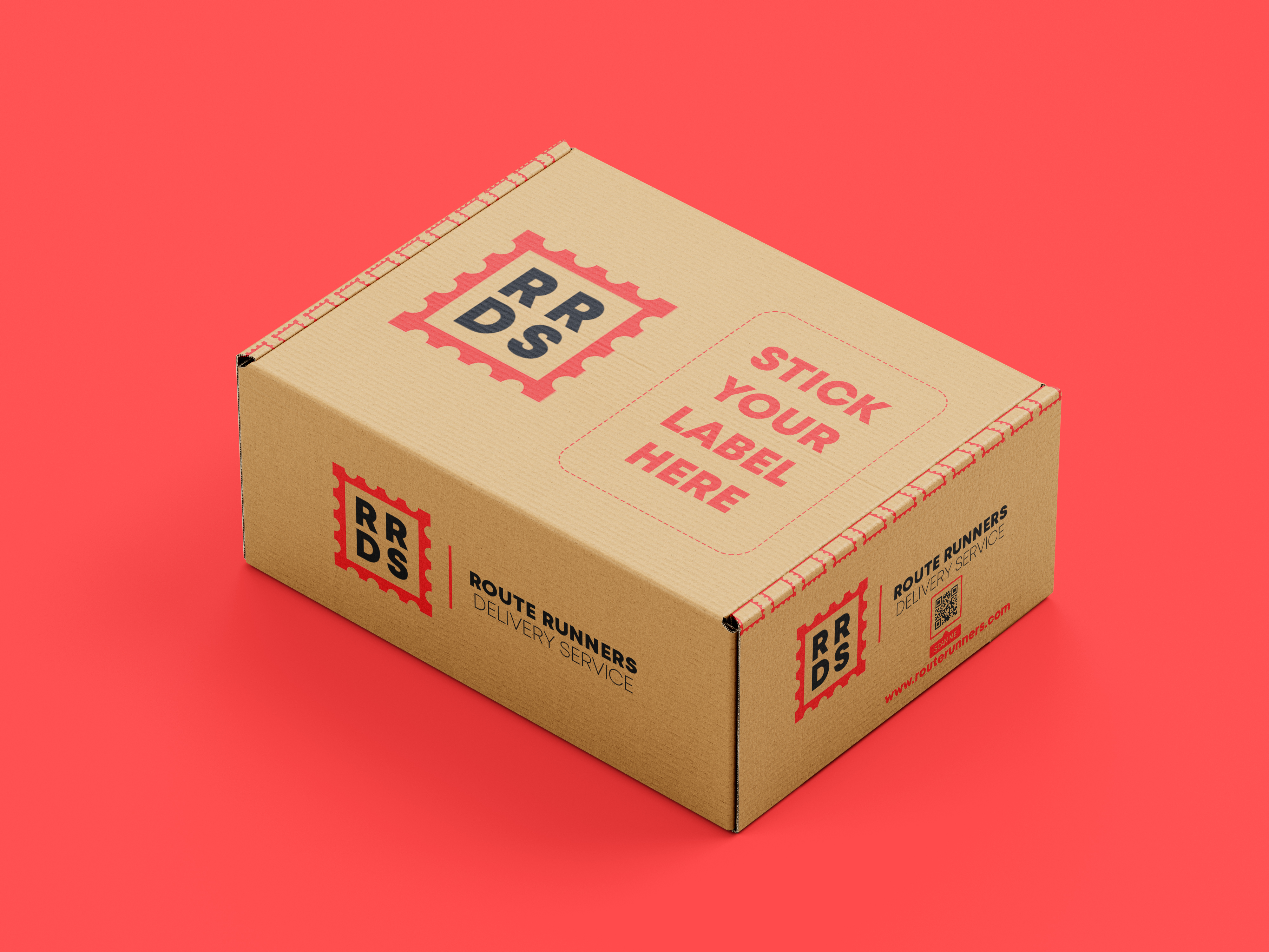
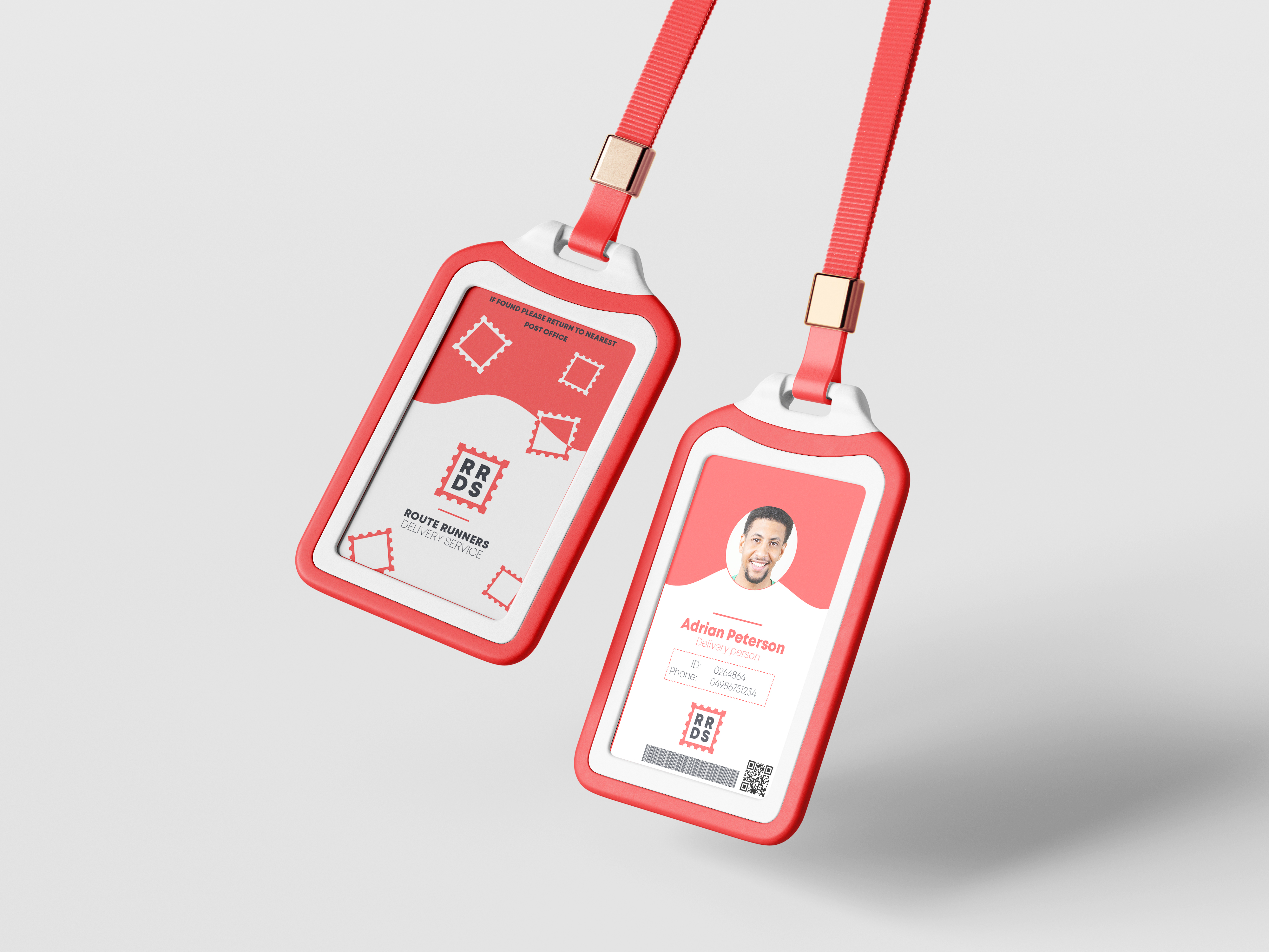
The courier service sector has several key players that already exist and, as such, it is important for RRDS to convey to their clients through their identity their dedication to efficient service, leaving no room for overcomplications or confusions. To achieve this, the cornerstone of the identity is their logo, from which the rest of the design elements are extrapolated so as to keep the brand as simple and cohesive as possible, delivering a clear and attractive image from as few different elements as possible. This makes brand recognition a breeze for their clients, as any graphic element related to their brand immediately transports the client back to the logo.
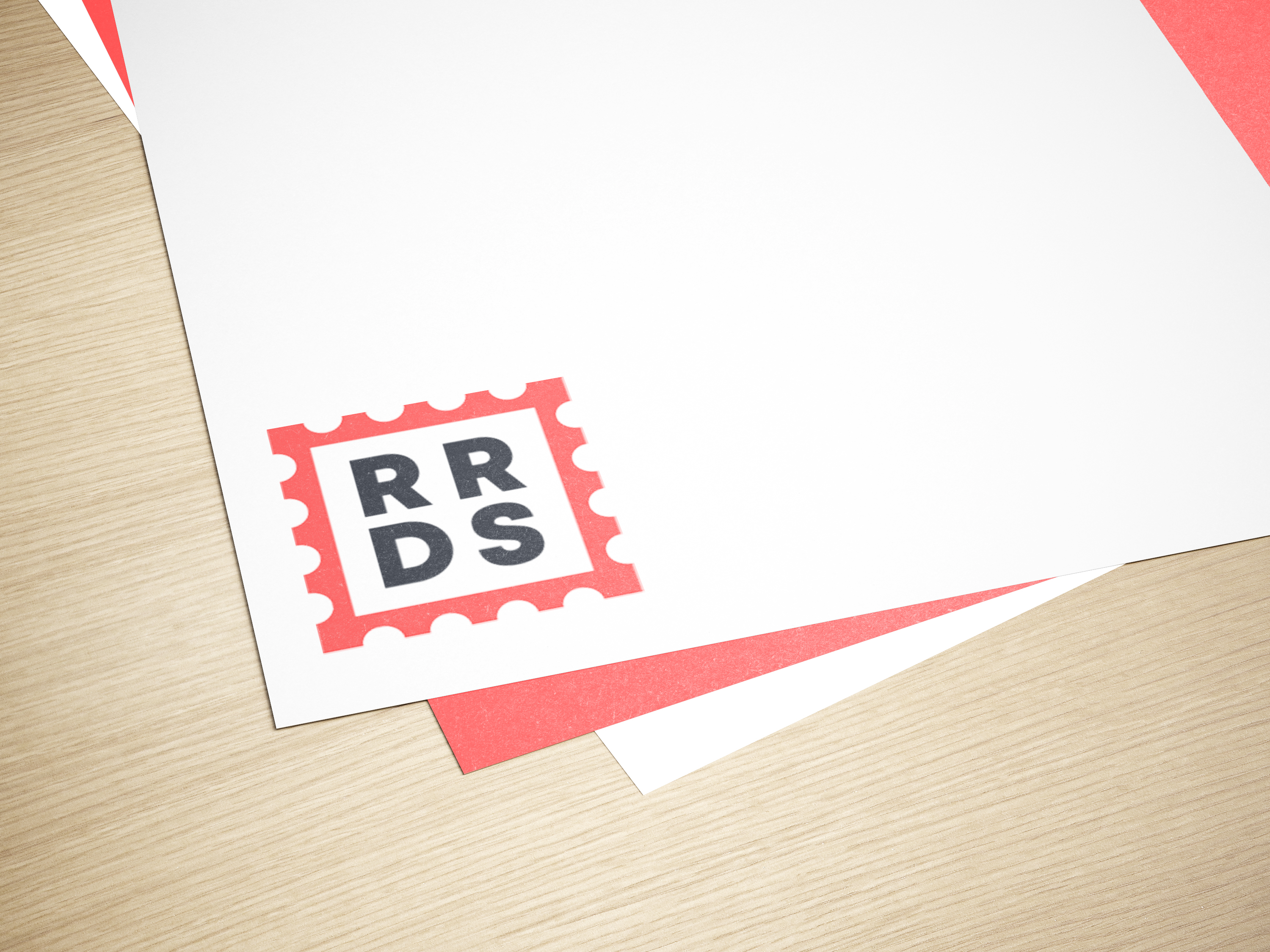
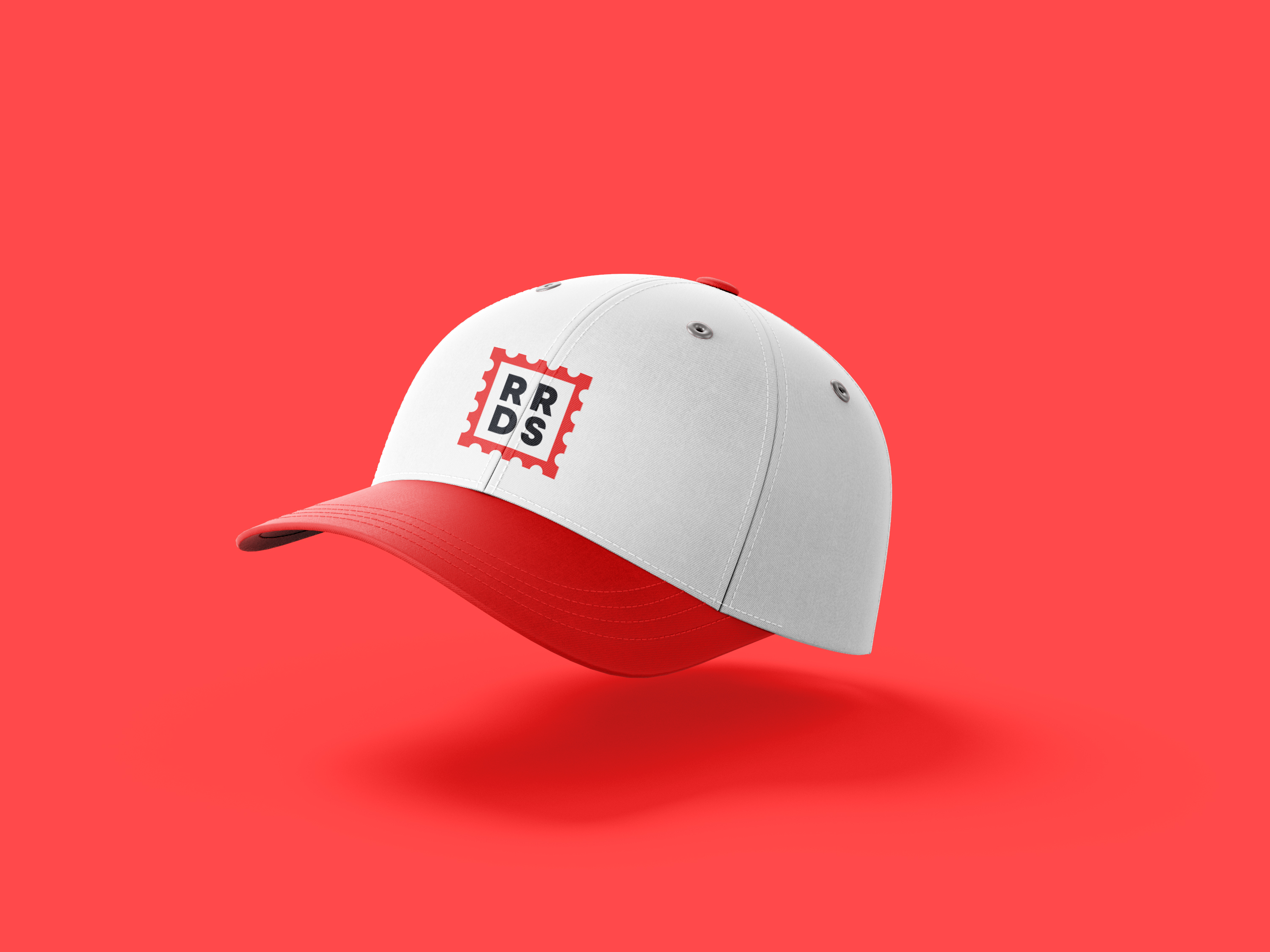
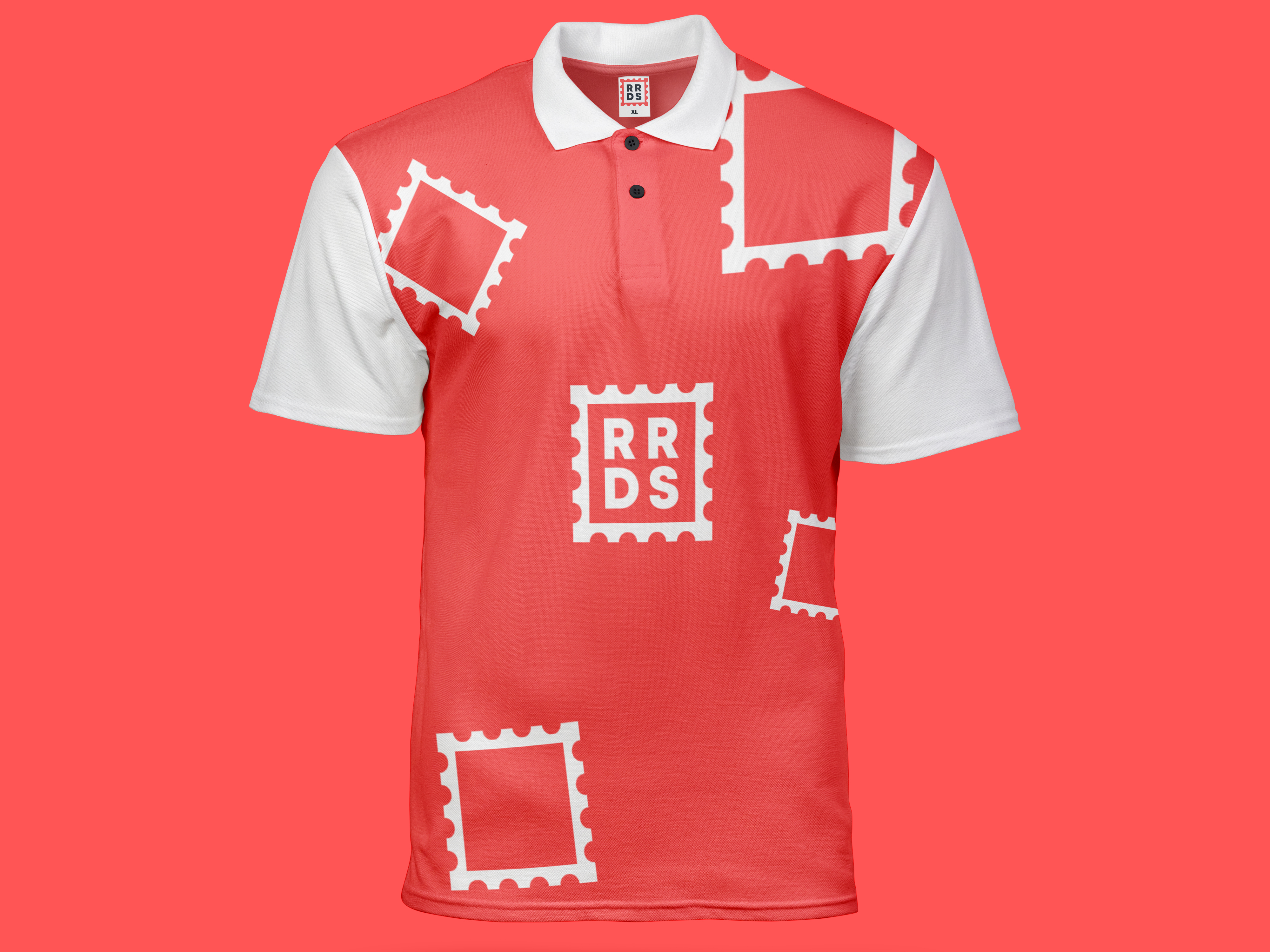
The bold red stamp featured in the design is a symbol of authenticity, speed and precision. Within this stamp the company's initials can be found in a bold and straightfoward typeface. This design choice reinforces their commitment to their brand not just being an image, but also a mark of excellence. The main tagline "Stamped for Success" also empowers the symbolism of the brand, as it not only relates back to the main imagery of the identity, but also reinforces their promise of dedication.
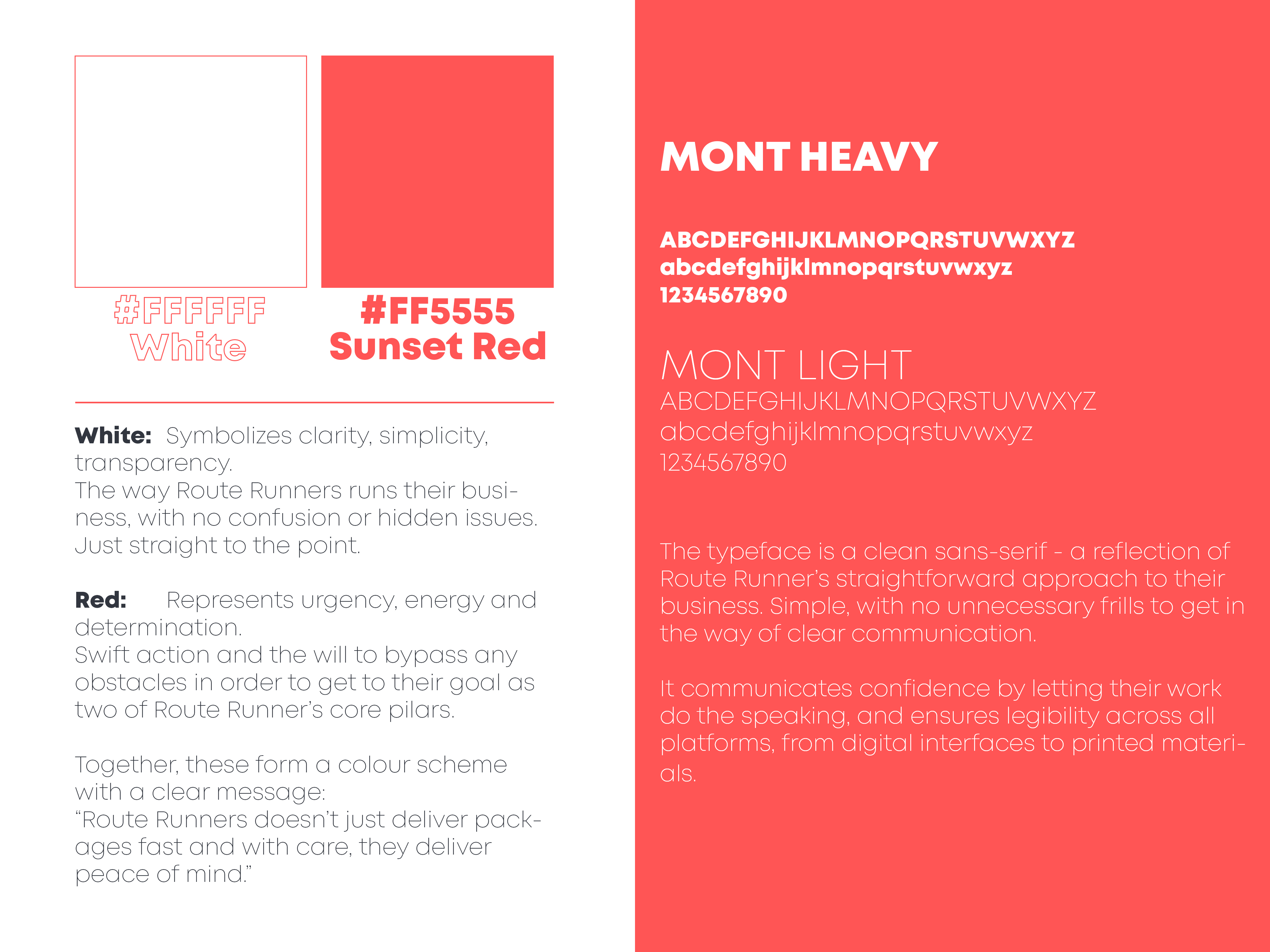
RRDS's color scheme has been meticulously chosen to convey their values. Red, which represents urgency, energy and detemination, brings forth the first half of their message: the essence of their service is swift action. Combined with the second color, white, which represents clarity, simplicity and transparency, the message is clear: Route Runners doesn't just deliver packages fast and with care, they deliver peace of mind.